BARBARA FREETHY | Why Can't Books Have it All?

 Ever since I began writing I've heard numerous writers and editors say that books need to be one thing ... because then it's easier to sell them. The reader needs to see one emotion emblazoned across the cover, scary, funny, mysterious, sweet, sexy -- to name just a few. Books that blend these elements tend to be more difficult to cover and to market. Which has always been a problem for me, because I love nothing more than blending elements and complicating my stories.
 I was writing emotionally poignant contemporaries when the cartoon cover came to life and kicked all the other contemp covers out of the pool. Suddenly every single author and every single contemporary had that cartoon cover look, legs, silhouettes, and stilettos that were fun, fun, fun. I personally liked the covers very much, because they jumped out at you and practically screamed, "read me, I'm going to be a good time". The quieter covers began to fade away and where once on the shelves there was nothing but Adirondack chairs, now it was all legs.
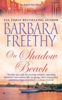
But as we all discovered over time, not all contemps were particularly funny or fit that look. At some point I think readers began to distrust the covers. They weren't sure exactly what they were getting. And authors who weren't writing funny, were either getting covers that didn't quite fit, or they were being encouraged to change their stories. In the end, that part of the market took a tumble, and the pendulum swung to dark and dangerous -- vampires, serial killers, dead bodies ... you know the look I'm talking about. Everything went dark. Recently there has been a trend back toward the scenic landscape covers, which embody my new series at Angel's Bay.
I personally love my new covers because I think they really blend the elements. While my books do take place in a small town, there's also a little suspense, a lot of emotion, a touch of humor, and a hint of the mystical. Did I mention that I like to complicate things? I love stories with layers. I always have a backstory mystery -- I can't help myself even though I sometimes drive myself crazy trying to figure out what happened a hundred years ago. That mystery always ties into the present. And the characters have relationships beyond the the powerful romance that brings two souls together in a town where many people have lost their way at one point or another.
I've seen my books reviewed under mainstream, romantic suspense, contemporary and women's fiction. I don't know what they are exactly, but I hope they're good. While I appreciate the art department's difficult job in trying to accurately create a cover that portrays the best selling element of a story, I hope writers don't ever lose sight of the fact that a good book is more than just one thing. My favorite writers hit as many notes as I do. And whether they're writing a funny contemp or a sexy historical or a terrifying suspense, they always remember that the characters are three dimensional, that sometimes sex is funny, that sometimes the strongest alpha hero succumbs to his emotions, that sometimes secrets are hidden in small towns and ordinary people have extraordinary adventures.
What about you? What draws you to a book? Will a particular cover element sell you every time? What's your favorite? And are their certain cover looks that drive you away?
If you'd like to check out my new Angel's Bay series, On Shadow Beach (Book 2), is now on sale and In Shelter Cove (Book 3) comes out on April 27th. While some of the story lines continue, each of the books feature a new central story and can be read on their own. Excerpts can be found at my website.
To comment on Wby Can't Books Have it All? and for a chance to win please click here.
Labels: barbara freethy


<< Home